
Context
Vesta Sleep is a D2C sleep products brand operating on a custom Shopify storefront. Having designed the core platform from scratch, my focus during the scaling phase shifted toward conversion rate optimization. The main business objective was to transform passive product interest into high-intent conversion right before the user enters the checkout flow.
Problem
Google Analytics and heatmaps revealed a clear drop-off: users actively explored products, but Add-to-Cart rates and AOV remained low. An interface audit identified three critical product risks:
bundle offers were isolated on standalone landing pages and minor banners, making them invisible during the primary purchase journey.
the cart drawer failed to visually or dynamically emphasize the financial benefits of adding more items to the cart.
reviews and social proof were buried in footers, failing to alleviate user hesitation where choices were actually being made.
My Role
I owned the pre-checkout experience from initial user research to final implementation. Working closely with Marketing and Engineering, I led the full optimization process: analyzing data, designing flows for the product page and cart, maintaining the UI kit, and measuring success through A/B testing.
Strategy
Transform the pre-checkout phase from a passive summary into an active growth layer by embedding conversion mechanics directly into key decision points, reinforced by contextual social proof.
Key Product Decisions
1. Analytics architecture & qualitative research
To uncover exact user friction points during product configuration, I covered the primary eCommerce flow with custom events and built the conversion funnels in Google Analytics. Also conducted 8 in-depth user interviews. This combined quantitative and qualitative approach confirmed that users wanted to build complete sleep sets but found the navigation too fragmented to do so efficiently.
2. Integrating bundle logic into the Product Detail Page
Hypothesis: Embedding bundle mechanics directly onto the Product Detail Page, rather than keeping them restricted to an isolated page, will lift conversion through context-driven placement.
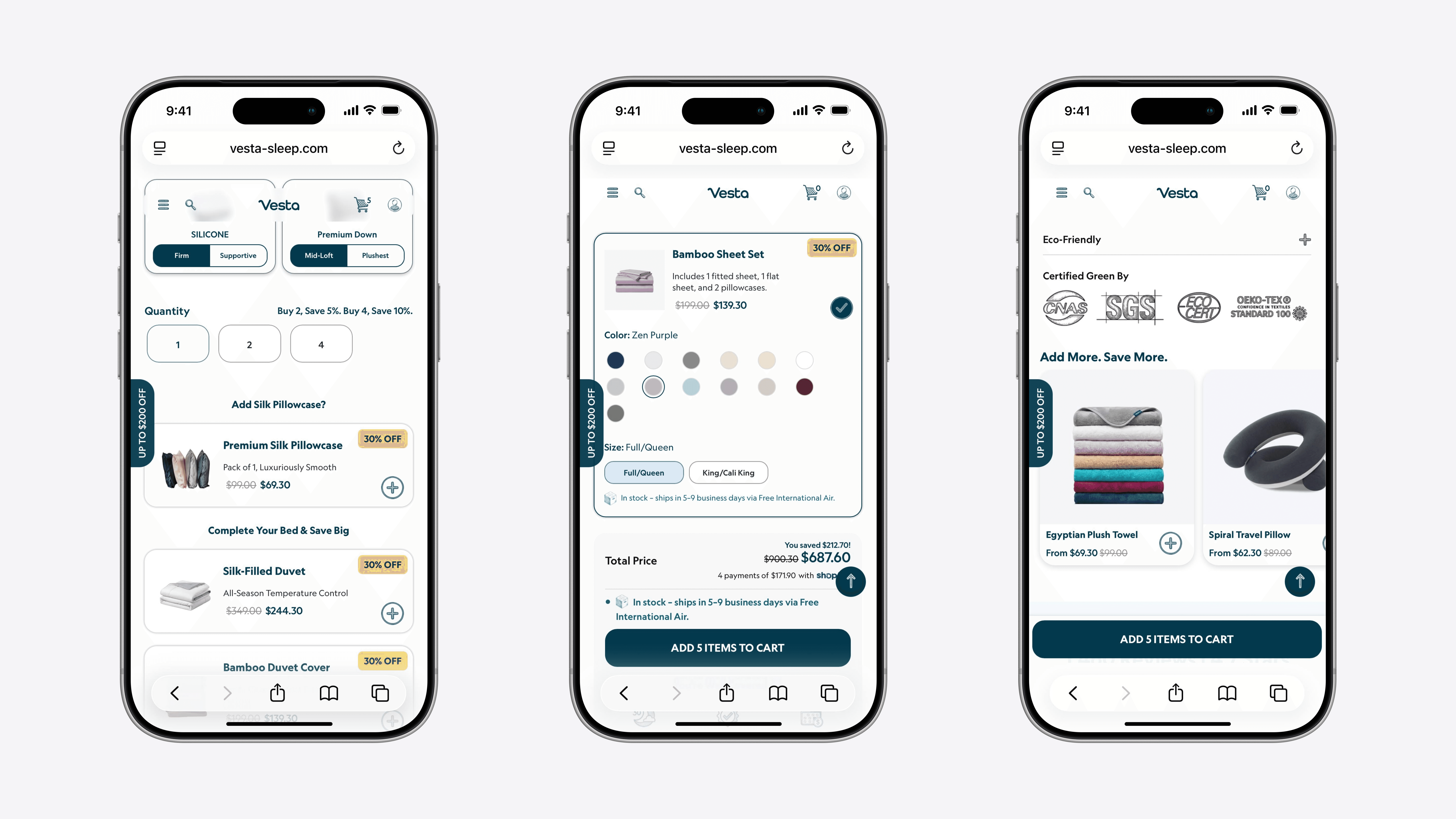
I redesigned the configuration flow by bringing bundle functionality straight to the Product Detail Page. While keeping the standalone bundle page intact, users could now assemble a complete set (e.g., pillow + pillowcase) natively, without navigating away from the core item they were viewing.
3. A/B Testing cart growth mechanics
To lift AOV, we designed and executed a 30-day A/B test evaluating two progressive milestone mechanics inside the Cart Drawer
variant A: a progress bar displaying abstract, incremental discount percentages (25% -> 50% -> 75%).
variant B: a progress bar featuring automated coupon applications with a fixed, currency-based reward (e.g., "Add 2 more items to get $200 off").
Result: With high statistical significance, Variant B won. Feature conversion increased by 9.2%. In a high-intent buying context, absolute financial clarity resonated far better with users than abstract percentages.

4. Designing an end-to-end trust layer
To target user hesitation right before purchase, we expanded our reviews infrastructure. We built a dedicated reviews hub with smart product-filtering and introduced compact, contextual review snippets directly above the fold on the Product Detail Page—right next to the price selector and primary CTA.
5. Streamlining marketing UI via a unified component library
To support rapid conversion experiments, I built a scalable UI Kit and a library of reusable components. This directly empowered the marketing team to independently assemble, test, and update promotional landing pages, completely removing the engineering bottleneck of custom coding every page from scratch.
Impact
Metric | Result |
|---|---|
Purchase Conversion | +9.2% |
AOV | +8% |
Time-to-Market (UI Kit) | -30% |